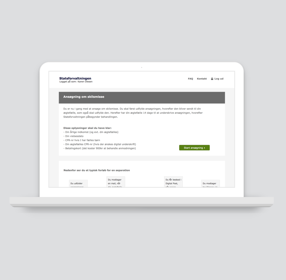
Reducing complextiy in a Public service
Client: The State Administration
Where: In2media (2015)
My role:
User research
UX strategy
User testing
Prototyping
Content production
THE PROJECT
The client wanted In2media to redesign the self solutions for divorce and separation. The main challenge was that questions were structured and formulated in a complex language and did not actually fit the situation that the users were in. Many of the applications were not filled out correctly which meant that the caseworker needed to disturb people in a very stressful period in their lives.
As a UX Lead on the project I was responsible for the design process and all the activities including: user research, UX strategy, concept development, content production, user testing and prototyping. The main focus was to understand the users and their situation and also examine how they actually talked about divorces. I transformed these insights in to a simple flow with meaningful questions that the users understood and could relate to.
Through out the process I suggested The State Administration that a UX strategy across the organization should be developed. The work with the self solution for divorce kickstarted a large service design project, which resulted in the State Administration winning the Digitalization Price.
RESULT
- The need for support dropped from 12% to 5%
- Higher completion rate and reduction of case processing time
- An increase in correct applications resulting in a fewer follow-up questions from the users
- A UX strategy across the organization was kickstarted by this project
Hopefully you don’t have to use the self service solution but if you do you can find it here:
More about the project:
User journey mapping
KPI framework
Small sketches to communicate ideas
User research - notes and analysis
The process turned upside down
The user research showed that in many cases the person who do not want a divorce was actually the person that started filling out the application. This mean that the application is often filled out by a person who suffers with both a lot of sadness but also anger and disappointment. Even the smallest miscommunication could result in an application that could not be processed which meant that the users should spent a lot of extra time in a period where they really do not need it.
With that insight I could restructure the flow and challenge some of the legally ‘stuff’ that did not really fit to this user journey.
At the same time I introduced a concept where questions with certain importance should have ‘consequence’ text, that appeared dynamic based on what the user answered. This helped to guide the user in the right direction.
Another important part of the concept was to always let the user know where in the process he or she was and when they could except to get feedback.
Wireframes with an example of a ‘consequence’ text
Wireframes with an example of the process overview


